


MassMutual went through a brand refresh where a few new colors and patterns were introduced as well as an entirely new illustration style. Previously the brand relied heavily on photography and video, with some abstract art elements and some basic iconography. Now they were introducing an illustration style for use in both print and video. Below you can see some selections from the deck provided by TWA, a Boston design agency who worked with MassMutual's in house team to create these illustrations.
Where I came in was taking this illustration style and coming up with some parameters for how to bring it into motion, such as exploring a cel animation approach, or using vector art. Deciding how how dynamic or restrained these illustrations will be in their motion. As well as exploring various styles from clean lines, to a rough, hand drawn feel.
Below you can view a couple explorations of slight style variations for animation. I explored one option at 12FPS with rough edges and a light boil to give a slightly hand drawn feel. As well as a 24FPS option with smooth edges. The pig is something I redrew based on the illustrations provided by TWA, and the boat is something I illustrated myself based on this style.
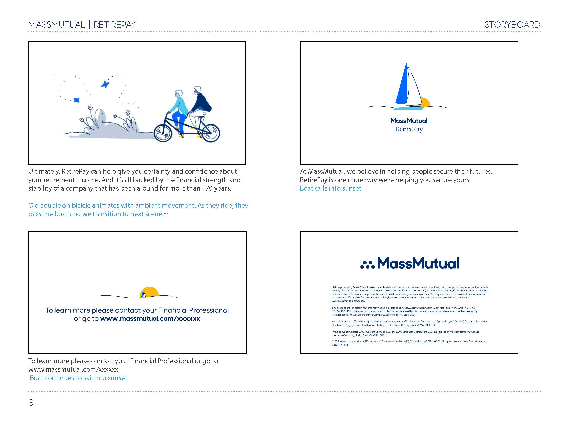
After working with the Creative Director and Art Director on MassMutual's in house team, and establishing some guidelines on how to animate in this style. I was tasked with making a flagship video, to put this new style into action. I illustrated some original assets for this piece, most notably, the couple on the bicycle with the plants behind them, as a way of exploring how to animate characters in this style in a way that can be standardized for future pieces.
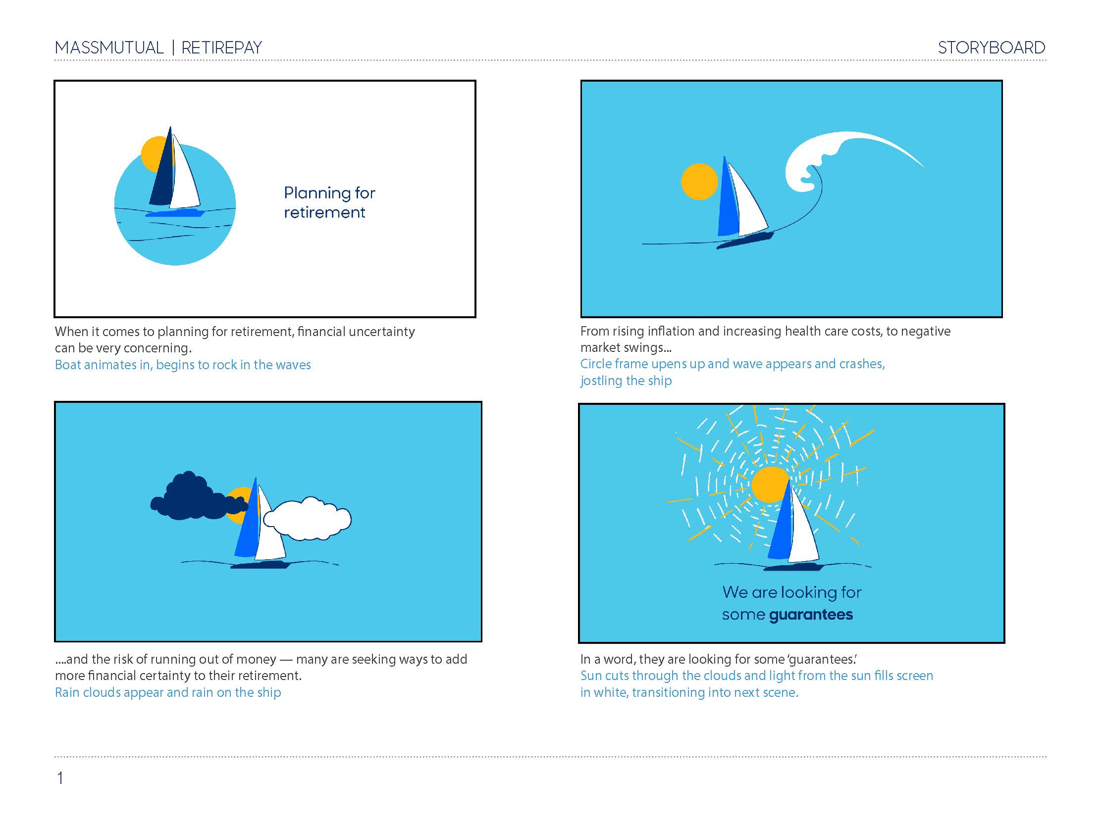
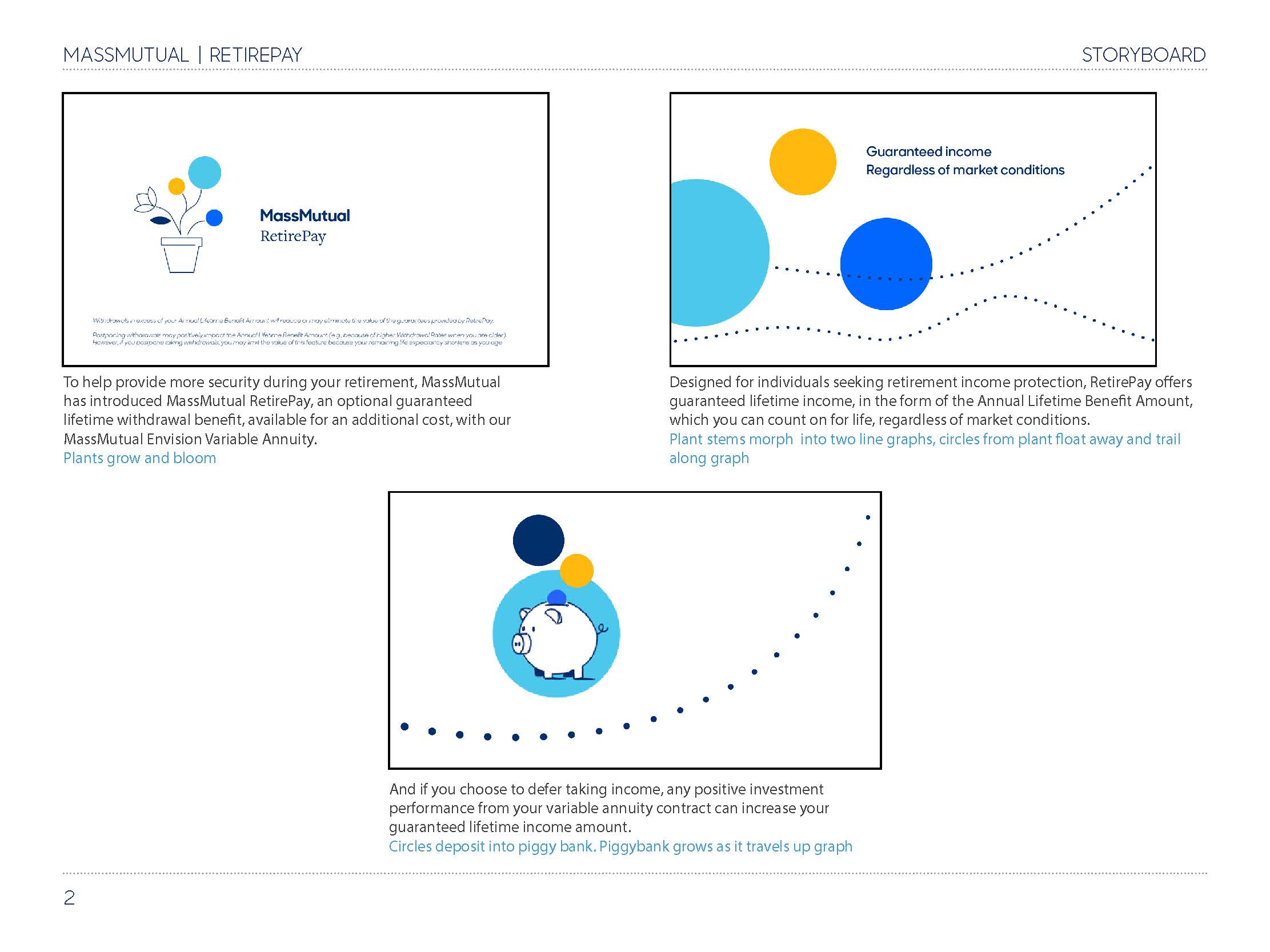
I created a storyboard which went through a couple rounds of edits, and landed on this as the approved piece. Below you can also find the final deliverable of this video.